How I used AI to create this Illustration | Plight
Once again, fellow humans, let’s talk about using AI for an illustration. So far using Dalle for preliminary sketches, or for quick conceptual iterations has been mad quick. And sometimes does churn out amazing ideas. And as much as I would like to illustrate everything myself, this workflow is really helping me focus on The Thousand Arms of Buddha.
—
In any case, on to some kind of a point then 🙂
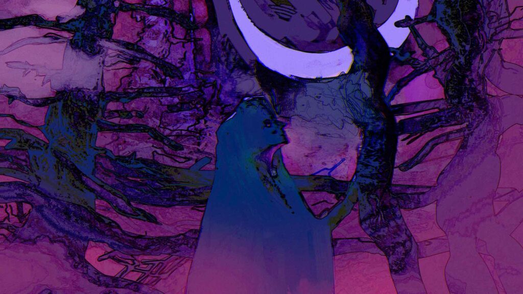
This is the process I used to illustrate the thumbnail for ‘The Soldier of Plight’, a poem I posted before.
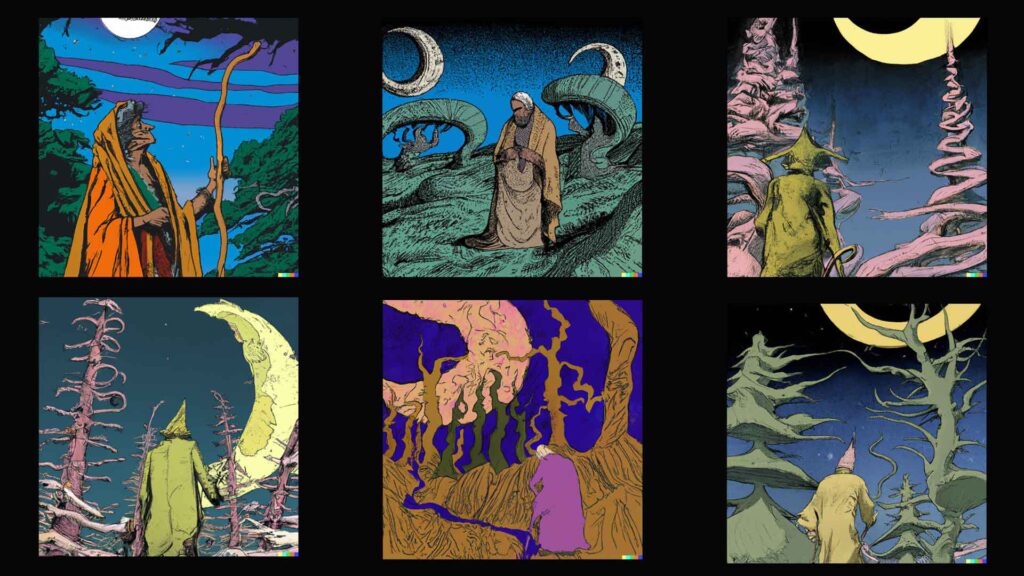
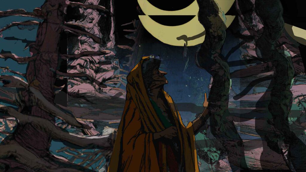
As a starting point I fed some ‘hermit in a forest at night with crescent moon’ type combination of prompts into DALLE and after some tweaking it spat out the images below. These are great. I really liked the surreal anime style trees and the bareness of it. Interesting shapes.
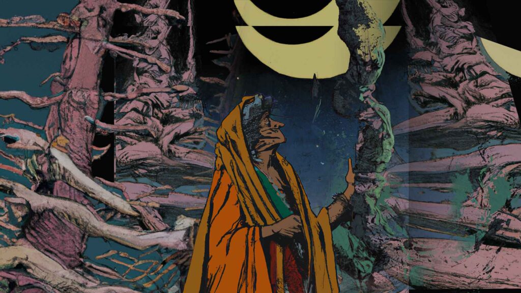
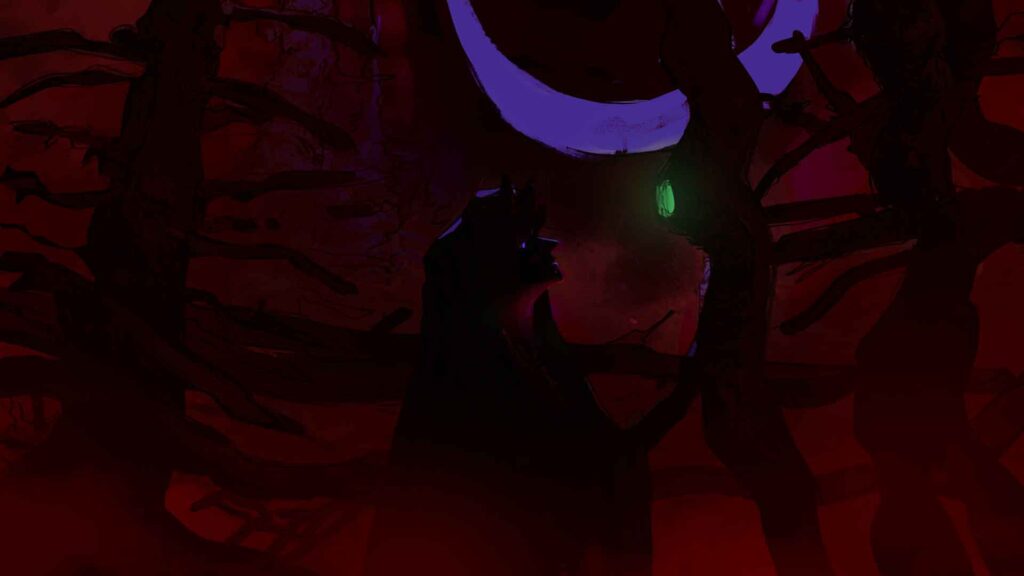
Post that I took the images and started photo-bashing them into a 16:9 format. Masking out the things I didn’t need. Do be mindful that though you see the below image at scale. At this stage I am zoomed out to a thumbnail and it doesn’t matter if it’s dirty or clean or whatever. I just need to like what is happening.
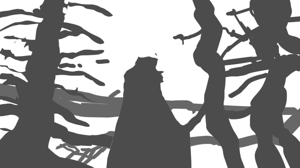
Just to be able to control the edges a little better and also to add shadows, I masked out these shapes over the image.
With the masks as shadows, it looks something like this.
Now from here on its a matter of taste and explorations. Initially, I had made the image super low key, because I was thinking, and this is funny, that I wanted the image to be super hard to see. But that does not work…does it?
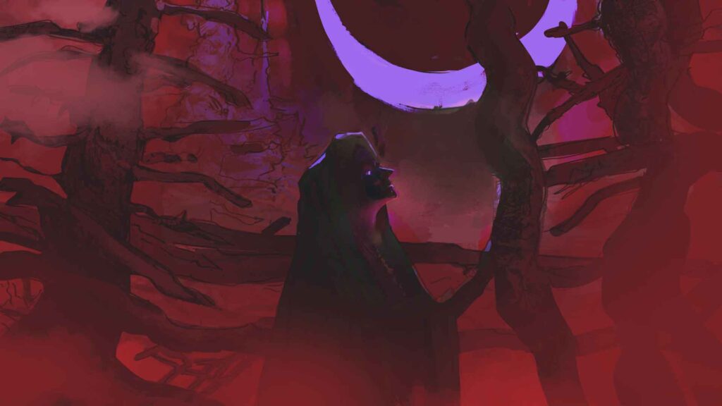
Because if no one can see the image, does the image exist?
So obviously I changed it with some levels adjustments. I also added some bits of fog to soften some of the hard edges but honestly its done at this point. Everything after this is photoshop magic.
Another reason I kept the initial image dark is because I find it easier to add light to an image.
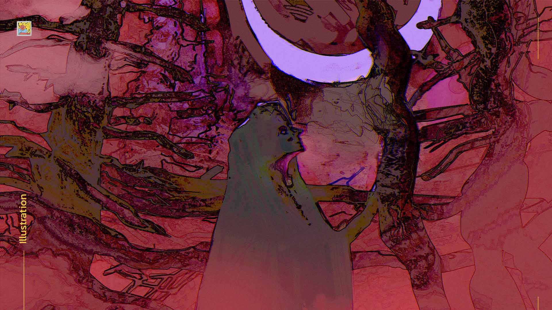
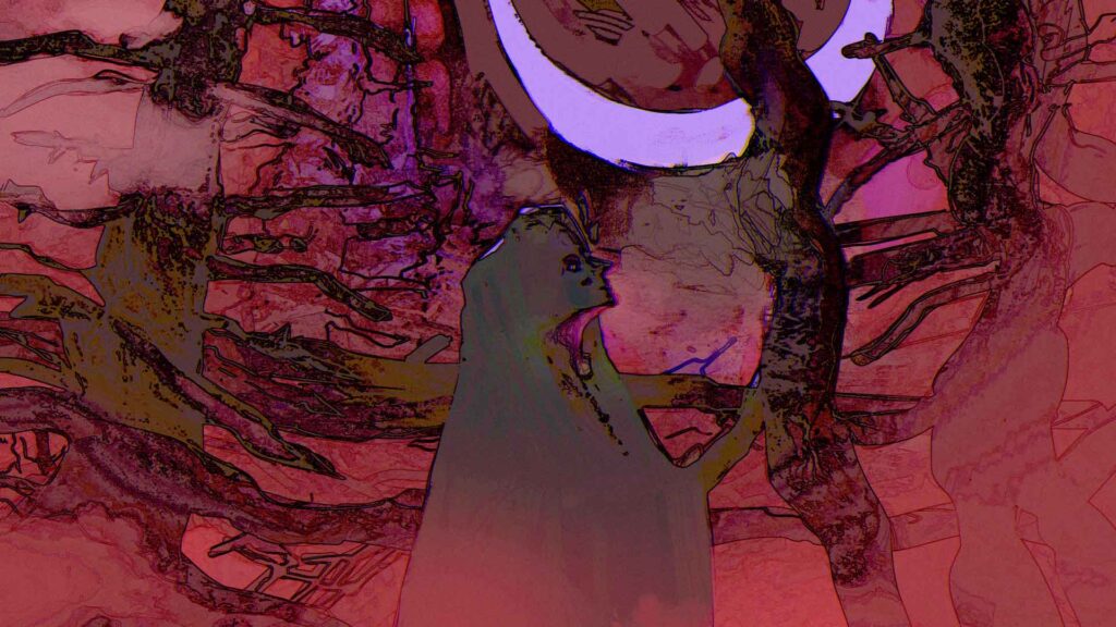
I used the find edges filter to create a line art on top of the illustration to give it more lines, something that is a personal preference, you can work more on the illustration to raise the contrast.
I kept feeling like the poem was more night-like and less blood-like. So I used some colour adjustments to bring the tones toward the blues.
That about wraps it up. Hopefully this was helpful to some of you out there.
Leave a Reply