Designing a Speculative Port for All Will Rise
Visualizing a city like ‘Muziris’ requires more than just architecture. Like I established in the last post, the ideas need to be grounded in a reality that immerses players into believing that they should care about the world and its future.
By the way, from the start I have known that All Will Rise is going to be one of the most interesting design challenges I have faced. The ‘extra’ bright minds writing and thinking this world have really put in the nuances on the page. And it really requires me to catch up to match up.
The Brief: A Speculative Coastline and a River on Fire
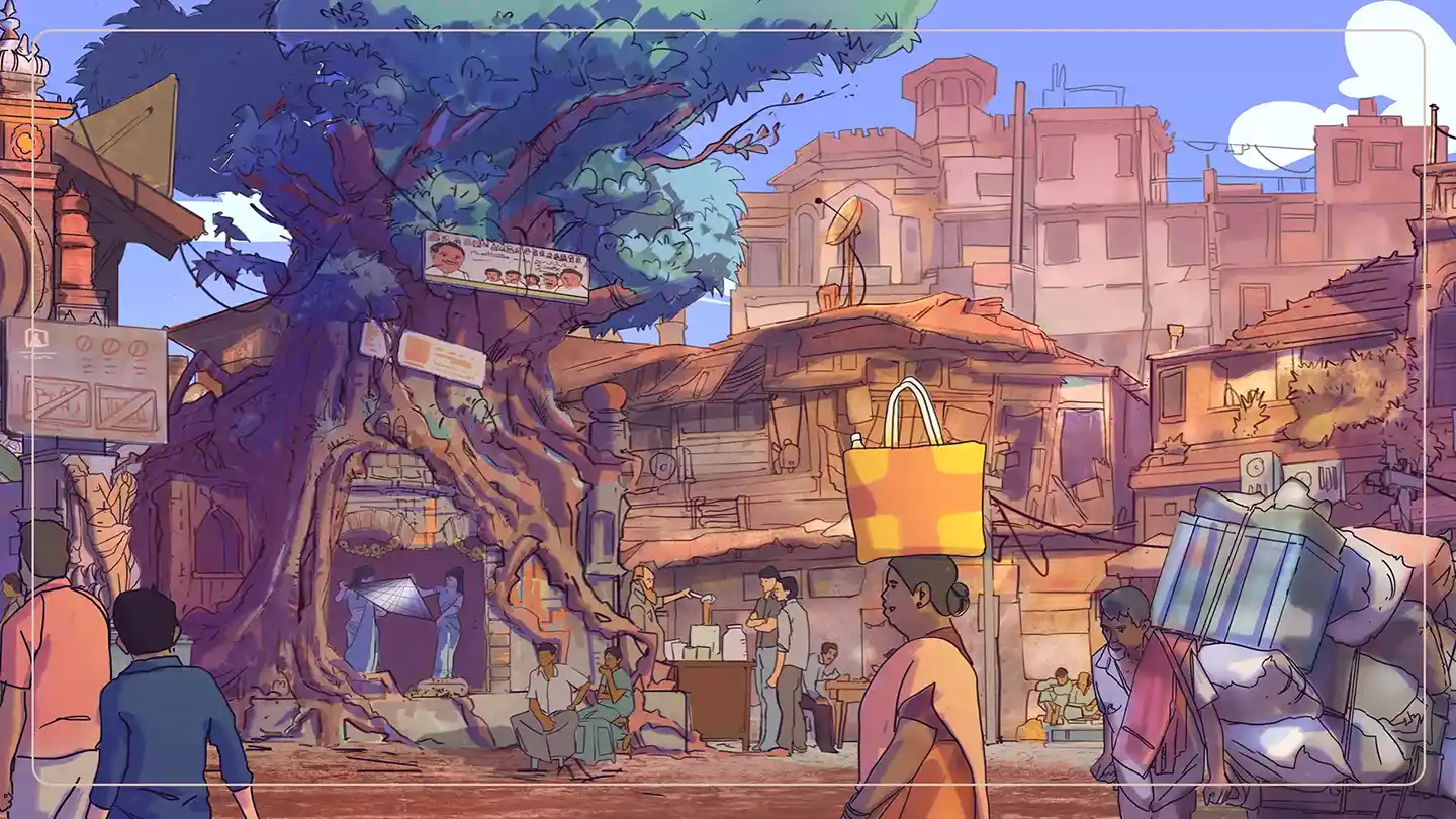
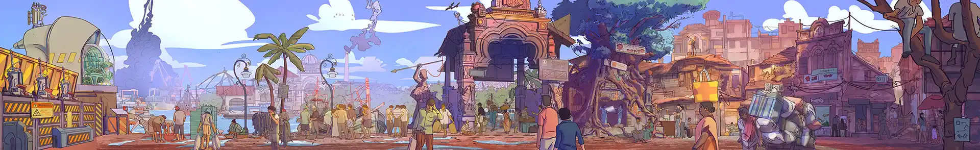
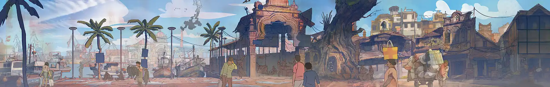
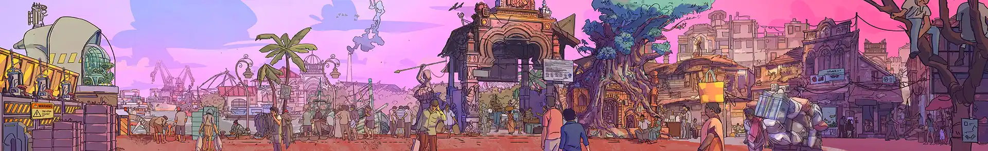
Starting out with a little overwhelming panoramic shot of a port where you can see a distant glimpse of a river on fire, but the world is still moves on.
How like life!
Starting notes
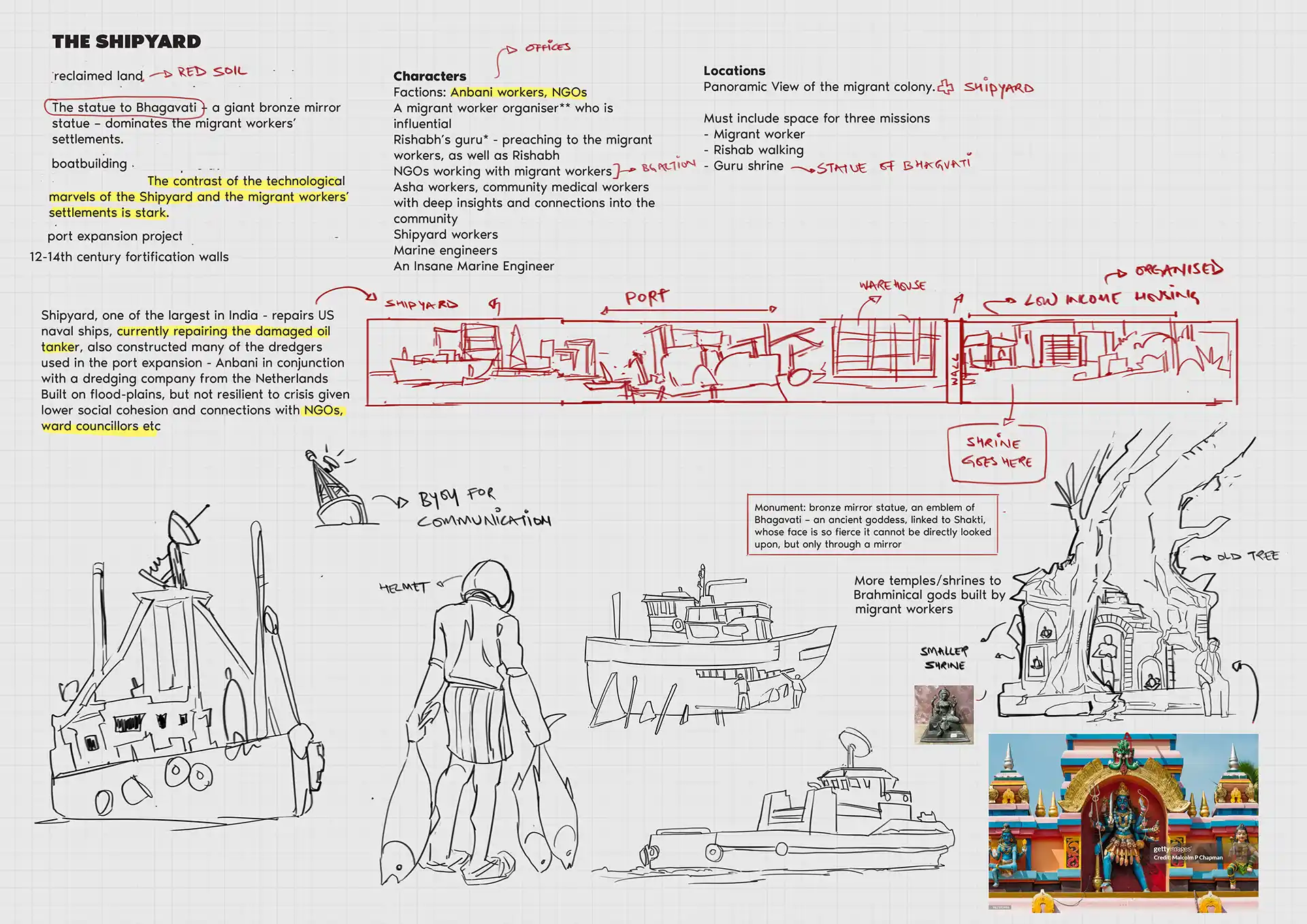
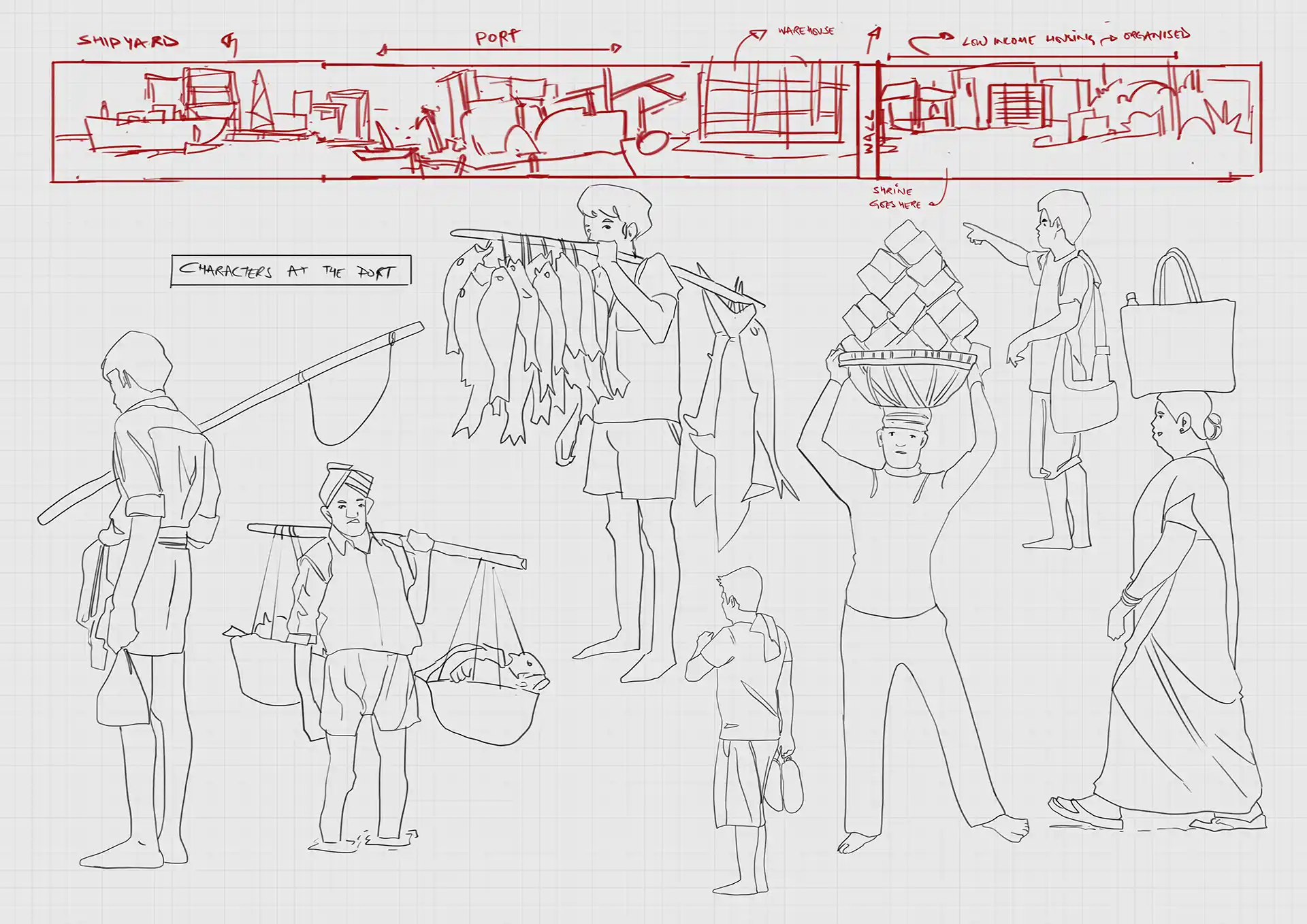
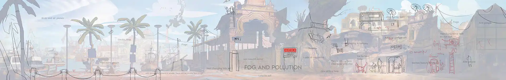
- A port forever under construction
- Boat jetties and ferry systems connecting smaller islands
- Public grounds for protests, assemblies, and political gatherings
- Luxury apartments built into old colonial villas
- Shrines to local deities — Kannaki, Ottamulachi — woven into everyday life
- A Syrian-Christian church acting as a community anchor
- Old Dutch warehouses repurposed into cafes and galleries
- Pollution control offices sitting next to informal economies
- Jain temples, street art, beaches, ferries, fort walls
Now. The idea here is to construct a coastal environment that feels dense, political, lived-in, and layered with history. To us this is about coexistence. Myriad systems and histories compressed into a single frame.
The brief reminded me of a visit to Kanchivaram. Standing there, I had felt, this immense feeling of wonder. The more-then-a-thousand-years-old architecture was very alive. And there were enough stories on those walls to fill my spiritual practice all the way to nirvana. Though, as you might notice, I decided to indulge in the side quest of being an artist and delay that eventuality.
My loss.
But the place has stayed with me. It was evident that it had witnessed mythologies and cultures come and go, kingdoms glory and wither, and witness a gazillion dreams perish on its stone floor. While the temple just stood their patiently. Witnessing. There is something calming about such an experience.
When I was walking around the sanctum that summer, barefoot with blisters, I came across a pigment of orangish-red. A colour I had never seen before, or since. I think it was a pigment that had escaped the fingers of ASI technicians (Archaeological survey of India), and had remained pure and true to its original colour from centuries.

That is what I wanted to capture in the image of the harbour. This pigment that feels like it belongs not in my world. Something that I am not sure of, But it exists.
Design Sketches & Notes
I usually start my images with feeling sketches. Visual thought you could say. Sometimes described by shapes, sometimes details. And in this case, inspired by the brief, I was looking for the people who inhabit these parts and the kind of architecture they live around.
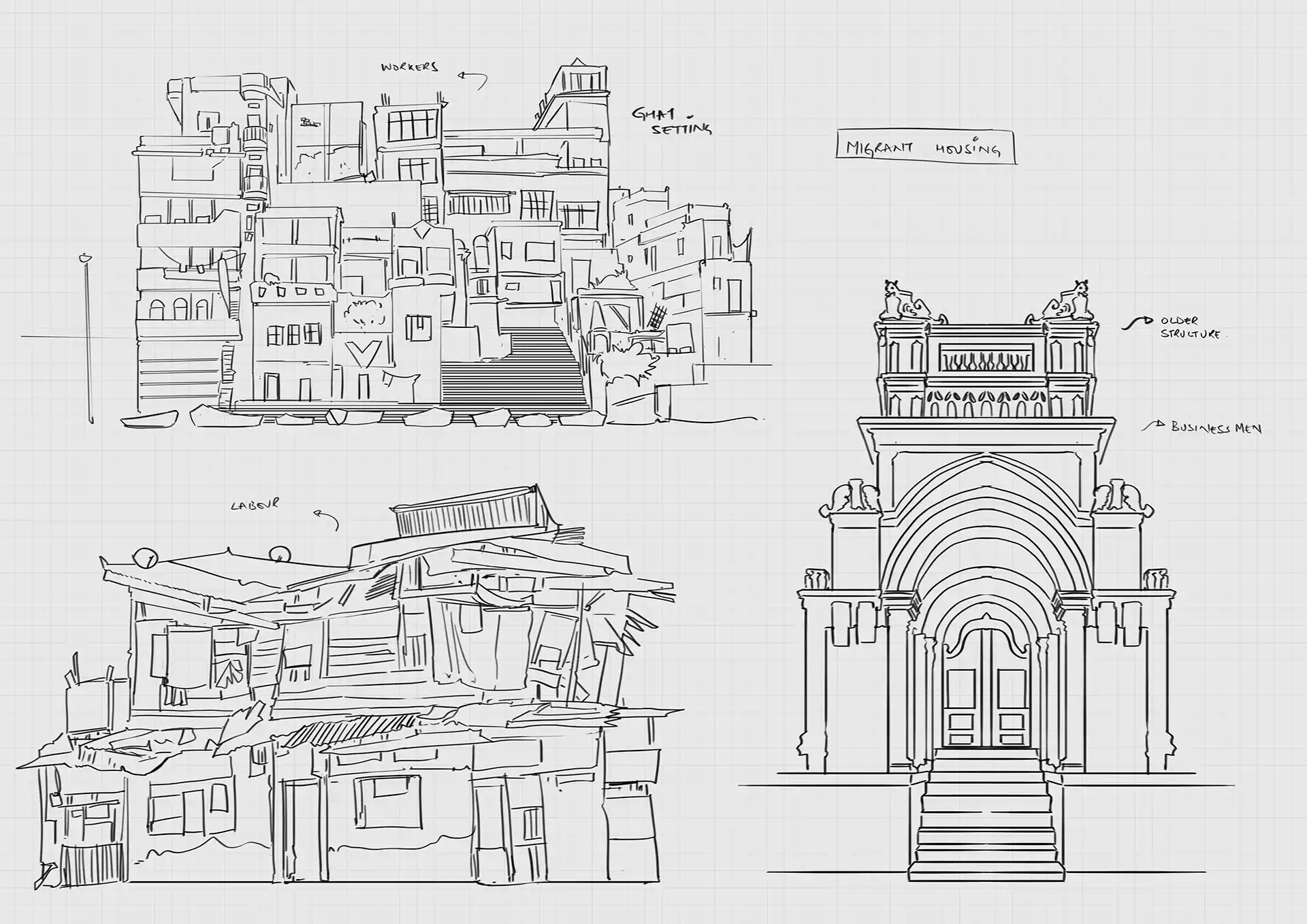
First Layout: An Arrangement of Ideas
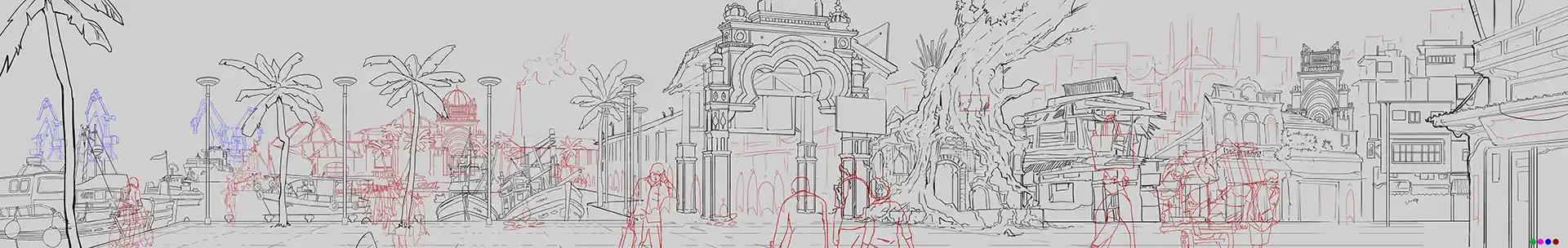
Once I had the sketches, I used those as modular pieces to put together a rough layout. This is not literal, because we were not creating modular assets, but only to assess how things relate to each other. Honestly, at this stage, I’m not even thinking about aesthetics. We can always make things look ‘pretty’. I’m thinking more about the presence of the harbour. What needs to exist in this space for it to feel like a real place.
And While the previous sketch feels more flat like a side scroller, based on some feedback, I also explored a more dynamic depth. And added a slight angle toward the right, as if the buildings were getting closer to camera and you could look inside the shops. But scale and perspective are demons of a different nature.
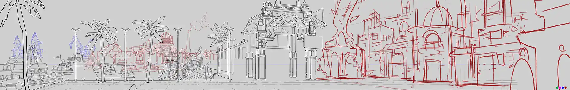
Value: Mapping Depth Before Meaning
Next is a rough exercise in depth blocking to understand the layers of the land. Darkest elements come forward. Lightest elements recede. Atmospheric depth, and all that.
This part is to check if the image reads fine, and if the layers are visible.
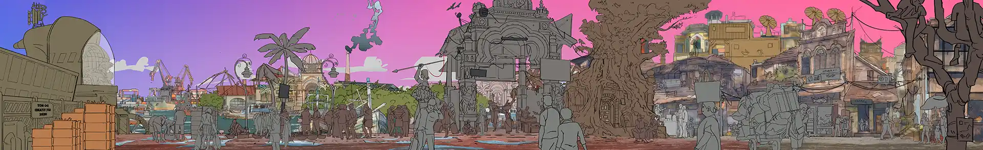
Colours break me
Colours are usually where things start to break for me. Usually. My first instinct is always excess. Too much colour. Slap-slap-slap. Too many ideas. All at once. Too many possibilities competing for attention. Just like the places I live in. A harmonious chaos.
As you will see later, in this case, I also had a brief encounter with a fantastical pink tone over this world (A vision of the wonderful, Joost) But we decided to pull back from there because the world needed to feel grounded I suppose. (I loved that vibe though.)
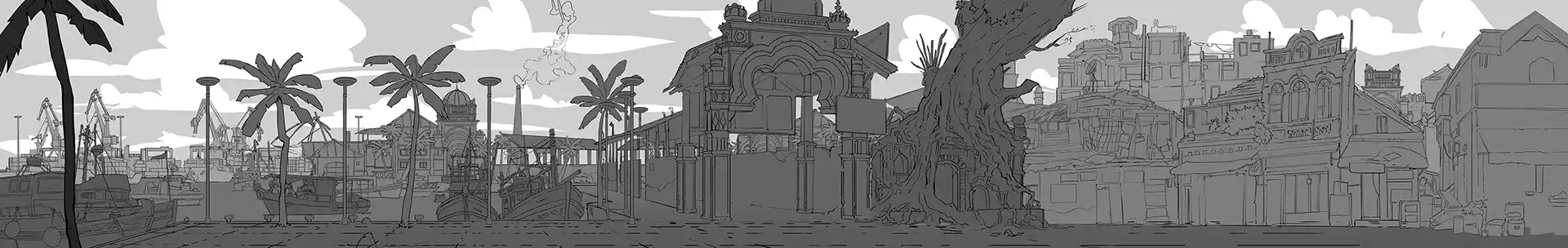
Adding Story with more Details
Now that the rough colours are in place. Somewhat. I started thinking about more details and more speculative elements. To me the above versions felt a little barren. A little more like a village rather then a city with history.
It felt like a place. But not a story.
So to bring in some more elements of interest into the picture I added a tidal energy generator on the right and more local details. While leaving the rest of the port intact. Going back to the brief; along with being a port/harbour, this is also a place that is constantly in transition. This is where the fisher folk earn their livelihood from, this is where the jetty runs from, et cetera.
The Push and Pull
Once the world is defined, the rest is a linear journey of rendering the colours. And making it ‘aesthetic.’ Usual process. Even in the chaos of what it is. As you can see in the above images, and the few below, that I am trying really hard to make sense of that fantastical pink. And it, border line, works. But it also feels a little out there. Crossing the realm of make belief.
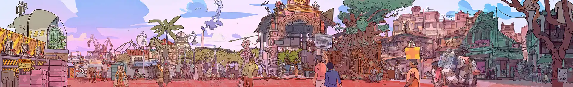
And like I said in the previous post, this is a believable make-belief world in a fictitious land seeking to immerse the player fully. So bringing it back to a more realistic tone of colours of colours makes sense. I think this is a thin line, sort of like how Tekkonkinkreet merges the realm of fantasy and reality.
Well that is how the port came to be.
